
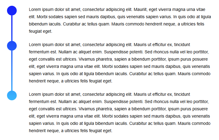
A client recently requested a stylized vertical timeline for a digital interface—one that needed to display multiple steps, each marked by a circle connected through a gradient line. Although the functionality might seem straightforward, the design requirements presented unique challenges, particularly the precise positioning of the circular indicators and the absence of scripting options. The timeline needed to be constructed entirely with CSS and HTML—no JavaScript or TypeScript manipulations allowed.
To deliver on the design requirements, Visus developed a flexible, maintainable, and lightweight solution that leveraged advanced CSS techniques. The final result achieved the desired visual effect while supporting any number of timeline steps.
The Challenge: Precise Positioning Without Scripting
The core challenge stemmed from needing to place circular markers exactly at the top of each text block along a continuous vertical line—without using any scripts to calculate or assign positions dynamically.
In typical implementations, JavaScript would determine the location of each circle. However, with a requirement for pure CSS, the approach had to be reimagined. The solution hinged on creative use of pseudo-elements, gradients, and SVG masking.
The Approach: Structuring the Timeline
The timeline's foundation consisted of a div for the vertical line and a sibling container wrapping each paragraph of text.
<div class="timeline"> <div class="line"></div> <div class="text-wrap"> <div class="text"><p>[paragraph text]</p></div> <div class="text"><p>[paragraph text]</p></div> <div class="text"><p>[paragraph text]</p></div> </div></div>
The .timeline container was styled as a flex layout, with the left-aligned .line styled as a wide vertical bar using a linear gradient. Each .text section sat to the right of the line.
body { font-family:sans-serif; padding:50px; line-height:1.5em; } .timeline { display: flex; } .line { width: 32px; background: linear-gradient(0deg, rgba(0,255,255,1) 0%, rgba(0,0,255,1) 100%); position: relative; } .text { font-size: 14px; margin-left: 40px; width: 600px; position: relative; } p { margin: 0 0 20px 0; }
At this stage, the timeline appeared visually correct with a solid vertical bar and corresponding text blocks, but the circular indicators were still missing.
Simulating Gaps with Pseudo-Elements
To "cut out" the space where each circle should appear, :before and :after pseudo-elements were added to the .text blocks. These created visual gaps in the timeline using white borders—essentially hiding sections of the line to simulate a cutout.
.text:before {   content: '';   position: absolute;   bottom: -20px;   left: -72px;   width: 4px;   height: calc(100% - 12px);   border-left: 14px solid white; }
.text:after {   content: '';   position: absolute;   bottom: -20px;   left: -58px;   width: 4px;   height: calc(100% - 12px);   border-right: 14px solid white; }
These visual interruptions gave the appearance of square gaps in the vertical bar at the correct positions. However, the goal was to create circles, not squares.
Masking Squares Into Circles with SVG
To finalize the look, SVG masks were introduced to convert the square cutouts into circles. An additional .step container was added inside each .text block, positioned directly over the square gap. Each .step block included a background image using a transparent SVG to visually carve a circular hole into the gradient bar.
<div class="timeline"> <div class="line"></div> <div class="text-wrap"> <div class="text"><div class="step"><p>[paragraph text]</p></div></div> <div class="text"><div class="step"><p>[paragraph text]</p></div></div> <div class="text"><div class="step"><p>[paragraph text]</p></div></div> </div></div>.step { width: 32px; height: 32px; position: absolute; top: 0; left: -72px; background-image: url("data:image/svg+xml,%3Csvg xmlns='http://www.w3.org/2000/svg' width='32px' height='32px'%3E%3Cg%3E%3Cpath fill='%23FFFFFF' d='M16,0H0v16C0,7.164,7.164,0,16,0z'/%3E%3Cpath fill='%23FFFFFF' d='M0,16v16h16C7.164,32,0,24.837,0,16z'/%3E%3Cpath fill='%23FFFFFF' d='M16,0c8.837,0,16,7.164,16,16V0H16z'/%3E%3Cpath fill='%23FFFFFF' d='M16,32h16V16C32,24.837,24.837,32,16,32z'/%3E%3C/g%3E%3C/svg%3E%0A"); }
This SVG overlay ensured that each square was smoothly rounded into a circle, perfectly aligned with the top of each content section. The result: a polished, multi-step timeline with precise design fidelity—achieved using only HTML and CSS.
Click here to view the JSFiddle demo
Key Takeaways
- CSS-Only Strategies Are Powerful: This solution highlights how seemingly complex UI requirements can often be addressed with thoughtful CSS, avoiding the need for scripting altogether.
- Maintainable by Design: The final implementation allows future developers to easily add or remove timeline steps without modifying any JavaScript logic.
- Pixel-Perfect Results: By using pseudo-elements and SVG masking, the timeline preserved design intent without compromising accessibility or flexibility.
Delivering Value Through Innovation
For this client, the need was clear: a visually appealing, accurate, and easily maintainable vertical timeline. Visus delivered a solution that balanced creativity and technical precision—demonstrating how even unconventional frontend challenges can be solved with elegant simplicity.